

Neale Whitaker shares his tips on how to choose Print Curtains
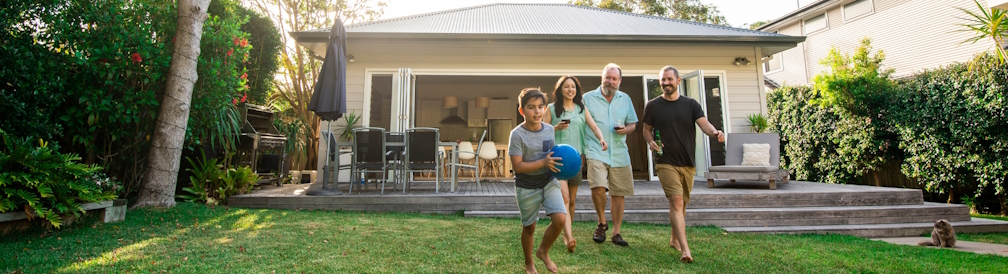
Window treatments might be the last thing you think about when designing your space but they're the finishing touch that every room needs. When it comes to curtains, they can make or break the look of a room. Not only do they make a space feel finished, but they have the ability to transform an interior, whether it’s creating the illusion of a higher ceiling, drawing the eye across a room, or framing views to a beautiful vista outside.
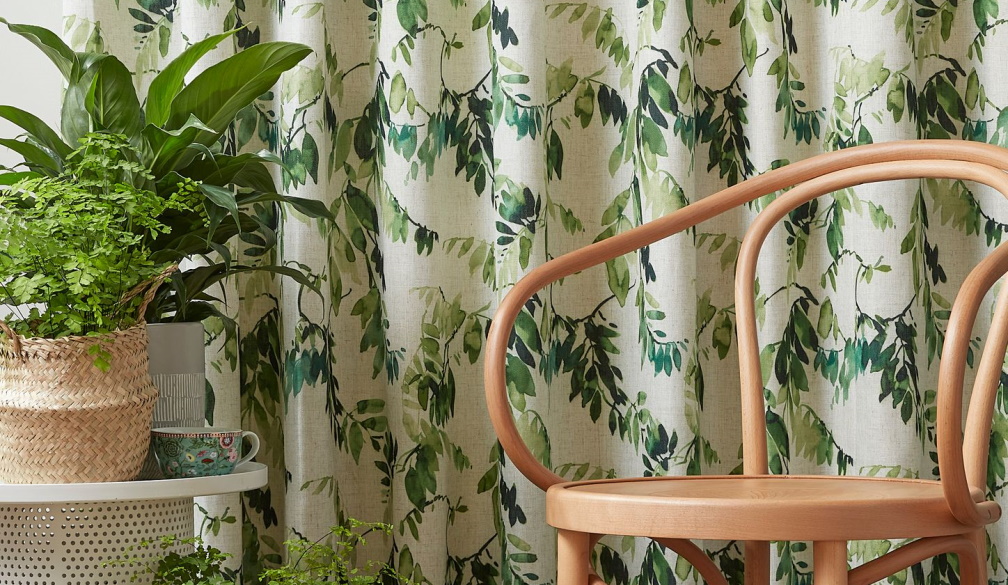
With patterns sourced from creative houses across the globe, the all-new Luxaflex® Curtain prints collection, has innovative prints that connect the outside world with evocative colourways of the coast to vibrant hues of the tropics. Inspired by biophilic design, water impression paintings and botanical motifs, the print curtain collection delivers on the ever-evolving need for nurturing and wellbeing in our spaces. With nine bespoke designs on offer, of which three are designer-exclusive, the print range will enhance any interior space.
When it comes to choosing a print curtain Neale Whitaker, interior design expert and Luxaflex® National Brand Partner, says, “Choosing a print curtain is similar to choosing a large artwork or wallpaper. Ask yourself these questions; What statement are you looking to make? Do you want a print that complements your existing colour palette and decor, or contrasts with it? Do you want the print curtain to be the main focus of the room, or be a backdrop to other furnishings?” If the answer is the former, then Neale suggests one of the more decorative prints. If it’s the latter, then opt for a softer, more abstract print. Neale adds, “Full-length print curtains will always make more impact than short curtains, and a contemporary twist is to use prints in conjunction with blinds or sheers. Not only will they look beautiful, but the additional layer will protect your print from the strong Australian light.”
Neale is a firm believer in bending the rules when it comes to interior design, and sometimes even breaking them, however, prints should always be considered carefully, as you want them to be a focus of your room, that's why you've chosen them. For those who love to bring the garden into their homes and add a pure dose of harmony to their décor, the Luxaflex new prints collection, “Vintage Garden” and “Fuji Canopy”, will add a floral and foliage explosion to a space. With a selection of colours ranging from monochromatic blacks and greys to the sophisticated glamour of gold, as well as a choice of fabrics, such as luxury velvet, faux silk and linen, the floral options will add a pure dose of harmony to the room. For a Japanese-inspired floral, “Sakura Blossom” is a print with delicate blossom flowers on a backdrop of silk, linen or voile fabric. The branch and blossoms of the print contrast with the subtle shade of the fabric creating an understated beauty and elegance.
For an alternative to a floral print, try a colourful botanical-inspired print such as the Luxaflex “Yansu Tropics” collection which creates natural appeal and evokes a sense of bringing the tropical outdoors into your home. Or, if you like a touch of East meets West, the “Peijing” range adds character and charm with its modern and bold colours of Zest green, Jet black and Indigo blue which will add a true style statement. To complement the room and grab attention, consider adding the same print fabric to cover an armchair, to finish off your space. Neale adds, “Whether you're installing print curtains or using prints on furniture, consideration must be applied - too many prints will cancel each other out, so it's about finding the right balance.”
Neale’s advice when it comes to mixing prints is, “You can, however, it requires a skilled eye.” To avoid your prints clashing, Neale’s advice is to limit your choice of prints to two and opt for contrast. For example, in the Luxaflex range, the soft, faded stripes of 'Hansha' – an ombre design with a complementary tonal range from light to dark tones and 'Iro' - a Scandinavian inspired geometric pattern, will blend perfectly with the more decorative patterns of 'Vintage Garden' or 'Peijing'. They contrast yet complement each other, especially when linked by a common colour.
Prints can be used anywhere in the home but work especially well in bedrooms. Teamed with crisp white bed linen, print fabric cushions added to the bed bring a relaxing and welcoming feel to your room. For the whimsical, “Tweets and Berries” takes on a light and joyful vibe to any kid’s bedroom or playroom. The pastel shades create a delicate finish and speak to natural material and finishes, while the darker tones deliver a matured dressing to an otherwise younger room setting. For a more “youthful” vibe “Cheeky Chirpies”, a Scandinavian-inspired print that features illustrations of birds, offers broad appeal, especially for a kid’s bedroom.
“Australians have long embraced prints - think of our love of brands like Marimekko and Missoni, but it's great to see a new audience appreciating more complex, decorative prints”, says Neale. “I predict we will be seeing more traditional prints used in conjunction with contemporary furnishings. The contrast will be interesting and exciting. From the Luxaflex range, I particularly like 'Yansu Tropics' and 'Sakura Blossom', but my favourite is 'Peijing', especially in Faux Silk Mint. The combination of colours is exquisite.”
From modern and unstructured to formal and sophisticated, the range of print options fits perfectly in any style of home. For more information visit www.luxaflex.com.au


